Now, I know what you’re thinking: “Colors? Seriously? How can something as simple as a shade of blue or a hint of yellow make a difference in my brand?” Prepare to have your mind blown, because colors are more than just pretty decorations – they’re powerful tools that can evoke emotions, convey messages, and leave a lasting impression.
So, grab your paintbrushes (metaphorical ones, of course) and let’s explore the magical realm of color psychology:
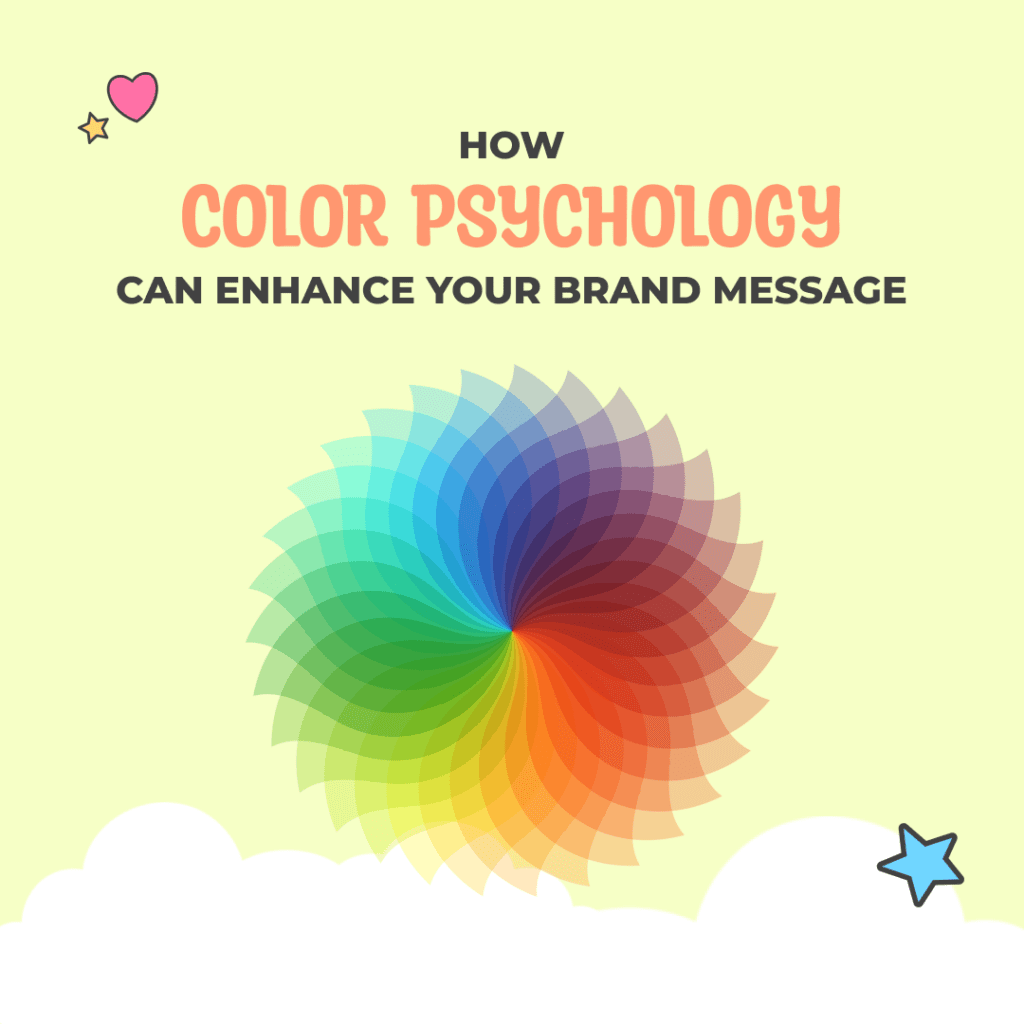
1. The Language of Colors
Think of colors as the alphabet of emotions. Just like words can express joy, sadness, excitement, or fear, different colors have their own unique language too. For example, red is often associated with passion and energy, while blue exudes calmness and trust. By understanding the emotional nuances of each color, you can choose the perfect palette to tell your brand’s story.
2. Setting the Mood
Imagine walking into a room painted entirely in black – kinda spooky, right? Now picture that same room bathed in soft pastel hues – ah, much better!
Colors have the power to set the mood and create atmosphere. Whether you want to convey professionalism, playfulness, or serenity, the right color palette can instantly transport your audience to the vibe you want to create.
The different contrasts also pay homage to and support your Brand Season, which helps you communicate your message in all avenues.
3. Making a Lasting Impression
Picture this: You’re scrolling through your Instagram feed, and suddenly, a burst of vibrant orange catches your eye. You pause, intrigued by this unexpected pop of color. That’s the magic of visual contrast – when used strategically, bold colors can make your brand stand out in a sea of monotony. So don’t be afraid to be bold, my friend – embrace the rainbow and let your brand shine!
4. Appealing to Your Audience
Just like you wouldn’t wear a clown costume to a business meeting (well, maybe you would, but that’s a story for another day), your brand colors should reflect the tastes and preferences of your target audience. Are you catering to adventurous thrill-seekers or sophisticated intellectuals? Are you targeting young, tech-savvy millennials or seasoned professionals? By choosing colors that resonate with your audience, you’ll create an instant connection that goes beyond words.
5. Building Brand Recognition
Think of your brand colors as your signature style – the visual shorthand that instantly identifies you in a crowded marketplace. Whether it’s the iconic red of Coca-Cola or the playful green of Spotify, consistent use of brand colors builds brand recognition and reinforces your identity in the minds of your audience. So pick your colors wisely and watch as your brand becomes an unmistakable beacon in the digital wilderness.
Choosing the right colors for your brand isn’t just about aesthetics – it’s about tapping into the power of emotions, creating memorable experiences, and forging deep connections with your audience. So grab your color wheel, unleash your inner artist, and let’s paint the town with the vibrant hues of your brand!